Thursday, 31 October 2013

What is Illustration? Part 1: Illustrative Pathways

After our weekly briefing on Monday 28th we went into our blog groups to continue our 'What is Illustration?' work. However a problem occurred - I, among many others in the studio, has misunderstood what was asked of us. The brief stated we find 25 images and print off all five of one pathway of illustration, where most of us had printed off one from each pathway.


(My five images showing Narrative, Socio/Political, Minimal, Humour and Concept)

Its very important to make sure I'm reading my briefs correctly. One simple mistake could set me back a huge way should this have been a big project.

We spent the rest of our time analysing the images that we had brought in and thinking about which different categories they could be put in. Finally we got together into one studio group and gave Fred our results. From these results we formed seven important parameters to search for illustration; Function, Content/Message, Process/Media, Atheistic, Context, Practitioner, Audience. I can say that due to each of these I have at one point searched for an illustration.

Wednesday, 30 October 2013

What is Illustration? Part 1: Illustration Categories

I developed a stomach bug last week which resulted in me having to unfortunately having to miss Thursday and Fridays studio time and workshops. I'll have to make up for what I've missed but I was able to spend a bit of time working on my Study Task 2.

Socio/Political:

http://www.belltoons.co.uk

I found this by Steve Bell a cartoonist for the Guardian. It looks like he made this during the last general election. I'm a fan of Bell's work as he draws politicians with such awkward humour, especially David Cameron - a bloated condom.


http://www.brainpickings.org/index.php/2012/08/10/dr-seusss-wartime-propaganda-cartoons/

I then found a cartoon by Dr Seuss from the war. His work is so similar to that of his Children's Illustrative work which works well in keeping away the graphic horrors of war and focusing more on the political.


http://blogs.buffalonews.com/adam-zyglis/

This piece by Adam Zyglis, a cartoonist for the Buffalo News, brilliantly shows the outrage on the Republic Elephants face at the prospect of Obama's health care reform.


http://www.nickandersoncartoon.com

Nick Anderson's piece perfectly encapsulates the weird fixation with the ugly pop cultural phenomenon we currently have to witness in the media.


David Horsey gives an interesting example of the American (Or Western) take on fairness and finance. I'm a fan of Horsey's work as he makes cartoons that are more interactive than most cartoons and pull the audience. Like this for example:

http://www.latimes.com/news/politics/topoftheticket/la-tot-cartoons-pg,0,1019230.photogallery#axzz2jIRSR1to


Narrative/ Sequential:

http://www.craigthompsonbooks.com/category/sketchbook/

I've recently finished reading Blankets by Craig Thompson, a coming of age graphic novel based on his own life. His amazing brush work convinced me to buy a brush pen of my own.


http://quentinblake.com

Quentin Blake is a favourite of mine. For years I've thought that his loose, style was what I wanted to reproduce. However since starting this course I've began to realise I have to create my own form.


http://www.shauntan.net

Someone in the studio recently brought in The Arrival by Shaun Tan. I had a look through this book and found the work to be so amazingly detailed! Simply beautiful illustrations aided by the lack of text in the book.


http://pdlcomics.tumblr.com

I've set up a Tumblr account and found Poorly Drawn Lines by 'Reza'. He narrates crazy irrelevant works drawn very minimally.


http://tonymooreillustration.com

The Walking Dead is currently drawn by Charlie Adlard but originally when the comic was only expected to run for possibly 6 issues it was drawn by Tony Moore. His work had much more detail and shading than what Adlard's work is.


Attention to Detail/Skill/Complexity:

http://cosasminimas.com

Blanca Gomez is a graphic designer and illustrator whose work I had never seen before now. This piece works for me as it centres around this huge balloon around the top of the page creating an interesting balance with the lower part of the page.


http://chrishaughton.com

Chris Haughton is an Irish children's book illustrator whose work is beautifully minimal and tells the tale of a little owl that falls from its nest with his mommy no where to be seen.


Phillipa Rice is one of my favourite people to follow on Tumblr. Her book 'Soppy' is a collection of small narratives that examines the day to day life of relationships in just red, white and black. She also works in very different mediums as can be seen on her Tumblr.

http://cardboardlife.tumblr.com

Conceptual Development

http://www.bobrafei.com/galleries/jak1/characters/source/jak_final_stance.htm

Bob Rafei is a cook designer who created the characters for the Jak and Daxter series on Playstation. I like how he exaggerates body parts to create a more cartoon like character.

http://conceptartworld.com/?p=33940


I'm a big fans of the Lord of the Rings/Hobbit films and look forward to the next film. This is largely due to the amount of concept work that goes into creating a fantastical world. Nick Kellar worked on the next film creating the dragon Smaug.

http://io9.com/5568011/ralph-mcquarrie-god-of-star-wars-concept-art/

The concept work is so different to the final outcomes presented in the film. I love the work of Ralph McQuarrie and his wonderful vision in creating these worlds and characters.

http://conceptartworld.com/?p=17507

Lisa Keene's concept art is occasionally darker than the what is seen in the Disney films she works for. However I like these darker images.

http://jeradsmarantz.blogspot.co.uk/2011/10/thing-designs.html

The Thing is a film that terrified me as a child, and I found the reboot/sequel/prequel quite freaky too. It's not wonder with concept art like this by Jared S Marantz.

Humour

http://miamigo.ca/index.php/previously

I like Ani Castillo's unusual humour. I also appreciate how she uses mostly just black ink with nothing more.

http://www.progressiveboink.com/2012/4/21/2912173/calvinhobbes

Calvin and Hobbes is a cartoon strip that appears in both black ink outlines and occasionally colours. Its an interesting view of life that can be both serious and humorous. 

http://bitterendblog.com/?p=11308

I've only just come across Chow Hon Lam, but i think he has a great humour to his work and a good eye for colour! There is also a good use of space within the piece here.

https://www.arcamax.com/thefunnies/hagarthehorrible/

With my parents unfortunately being 'The Sun' readers there were always copies within our house. I plus side was Hagar the Horrible that runs inside. It was sometimes cringe worthy however other times hilarious. It's very basic with usually only a few items within each panel.


I recently joined Tumblr and came across this piece by Alba Blazquez. Its a very simple piece with an illustration and text, however I feel it works very well.

Sunday, 27 October 2013

What is Illustration? Part 1: (Continued)

On Monday 21st we began our week as usual with our weekly Studio Briefing. After this we got back into our Blog Groups where we showed each other our 5 chosen works involving Informative, Concept, Narrative, Investigative and Promotive. It was interesting to see why others had chosen what they had and how different their choices were to mine.

After this we moved to a different table and organised other people's images to coralline with our 5 illustrative groups. We were then tasked with sorting the images into as many different grouping as we could such as whether the pieces were digital/analogue, humorous, black/white or colour etc. We came up with roughly 14 differing groups before, as a studio, we made a compiled list;

  • Use of Media & Method of Production
  • Tone of Voice
  • Simplicity of Image
  • Attention to detail / skill / complexity
  • Socio / Political Meaning or Message
  • Audience specific / engagement / interaction
  • Narrative - sequential imagery
  • Use of Type or Text
  • Relationship between Composition, Form & Format
  • Humour
  • Function or Purpose
  • Conceptual development, sketchbooks development work
  • Concept art & visualisation.
Our next task was to go away and decide on 5 categories to investigate before finding five images for each. This will result in a total of 25 images for next Monday.

I've decided (at the moment) I'm going to look at;
  • Socio / Political Meaning or Message
  • Narrative - sequential imagery
  • Humour
  • Conceptual development, sketchbooks development work
  • Attention to detail / skill / complexity

Sunday, 20 October 2013

What is Illustration? Part 1: Blog Groups

On Monday we were assigned into Blogging groups, the others in my group are; Adam, Orlaith, Sophie, Zara, Aaron and Abby. We are to make sure we all know each others blog groups as this will become important in the next few weeks/months.

In these blog groups we were given the task of deciding on five main areas of Illustration. We settled upon; Narrative, Promotion, Conceptual, Informative and Investigative. We were asked to find 5 examples for each and then whittle that down to our favourite five images (one from each category).

Here are my final 5 examples:


This is my example of 'Narrative'. I chose this as I feel it shows how simple a narrative can be - it sets up and executes a joke within four panels. The work is very digital heavy but that isn't always a bad thing.


 This is my pick for 'Investigative'. Its a photo of a page from a book I own called 'An Illustrated Life' which is a collection of illustrators works and features heavily their sketchbook work which I feel is very important to any type of artist.


I dont watch Mad Men, however when I saw this 'Promotive' illustration for it's sixth season I fell in love with it! The piece is made entirely from pencil crayons (before the digital text is added) and you get a sense of how much time it must have taken to create such a detailed piece of work.


Although it is an illustration that comes from a dark time in recent human history, the poster for the Anti-Semetic film 'The Eternal Jew' is a very informative poster. It exaggerates all of the features of the Jewish portrait in an attempt to 'inform' German people about the unsavoury Jewish man.


Finally I picked Greg Capullo's 'Concept' art for his work on Batman (2011) here he has detailed the changes in characters facial expressions. I am a huge fan of comic books and hope to break into the industry one day so things like this really appeal to me.

We will present these images to the rest of our Blog Group next week before going into the next task.

Saturday, 19 October 2013

Why Am I Here?

Why did I choose to study this programme?


I chose to study Illustration at Leeds College of Art to become a better illustrator, I chose this as it feels more engaging than Graphic Design or Fine Art. I want to illustrate my own children's book or graphic novel one day and this programme is the best way I can think to do that. Furthermore when I attended the open day the programme was really sold to me confirming my decision. I am most looking forward to working with people of a like minded capacity for illustration and learning.


What do I want to learn during my time on the programme?

My main goal is to learn and hone my illustrative style, I can draw already but I need to become better. This I can only do by applying myself which is something else I need to learn to do over my time on the programme. I need to be more professional in the way I handle myself in the study as well as the way I take my workload as I expect this to be a very intense course. I'm quite an introverted person so becoming more open socially is something I want to learn to do. I plan to do this by putting myself in social situations I wouldn't usually be in. Finally I need to accept my mistakes when creating work; I cant bare putting a foot wrong when illustrating but I've got to learn that making mistakes is what makes you a better artist.


What are my strengths?

In the context of illustration I feel my strongest skill sets are my line work and my water colour skills. I've only started using water colours in the last few weeks but feel they've really improved my work quality by leaps and bounds. In a professional sense I'm a very punctual person who listens more than I talk and takes a lot of notes. I feel these three attributes are very important in keeping on track of everything going on.


What do I want to improve upon?

Obviously I want to improve on my illustrative skills, this I'll do through learning new methods and experimenting more. But I also want to learn to handle myself in a more professional manner as this will be important when I come to actually work in the illustrative industry. Another thing I need to work upon is my social skills how I will do this I have already stated above. Finally my research and reflective skills need to be improved. These are integral if I'm going to work professionally and actually make a career for myself.


How will you evaluate yourself?

I will evaluate my continually day to day as I work with self critical thoughts and notes. On a less immediate, but still important time frame I'll be writing on a reflective blog which will be visible to my peers and tutors. My peers will also be able to critique my work in peer review sessions and group critiques after my own critical analysing this will be the next most common form of evaluation I'll have. Another form of evaluation will come from my tutors who will help me using their experience in illustration to guide my decision making with my work. Finally I can receive evaluation of my work through modular results, however these results are a last port of call so to speak in evaluative information.


Tuesday, 15 October 2013

Art Speigelman: Maus


I finished reading Maus today by Art Speigelman. Maus follows the hardships his Father faced during the holocaust before and during World War 2 as well as Art's strained relationship with his father in the present. The strip ran from 1980 - 1991 in Raw magazine before being collected into a 'Graphic Novel' format.


One of the more interesting themes within the story is that of Racism which Speigelman deals with by portraying different races as varying animals. Jewish people are drawn as mice whilst Germans are cats and Polish people are pigs. He overcomes issues of Jewish people pretending to be German by having them wear cat like masks, therefore giving a physical representation to the act.


Speigelman originally planned to use expressive styles and detailed imagery for the story but instead chose to work with a more direct and minimalist approach. Characters are portrayed with dots for eyes and a simple line for a mouth etc.


I personally felt that with the work being text driven this usually made the pages feel overwhelmingly busy, however I suppose with such a large powerful story to tell this is but a small issue.

Wednesday, 9 October 2013

Illustrators of Interest

Here I’ve made note of several illustrators that I’ve been looking at recently. There are several reasons why I like each of these artists be it their style or just because they have a somewhat political view.

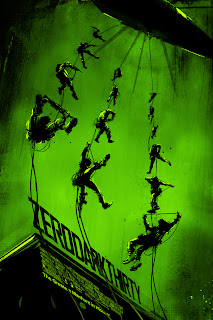
Firstly, is the work of comic book artist Jock. I’ve enjoyed his work for a few years now since picking up an issue of DC Comics Batman in which he was the artist. His work is dark and somewhat chaotic, whilst always being controlled. Meanwhile he expertly fills his imagery with black for shadows that make you want to see more than you can. He also does movie related work, having made variant posters for films such as ‘Zero Dark Thirty’ and ‘Iron Man 3’. 

http://www.4twenty.co.uk
Variant poster for ‘Zero Dark Thirty’

Then there is Chris King, I’ve only just discovered his work, but I’m a big fan already. His work is commonly centered around movie related themes but his website shows other quirky imagery. I like his pieces because his line work is strong and somewhat angular whilst also being complimented by bold colour schemes.


Here is an extract from one of King’s Sketchbook

Another artist I have only just began to look at is James Jean. His work interests me as it shows a lot of experimentation; something that I am aware I need to do more of consistently as an artist. His work is also very very detailed, which I am envious of as I struggle to devote so much time to a single piece, preferring to finish and move on quickly.


An example of media experimentation from Jean’s Sketchbook

I was going to include Steve Bell, a cartoonist for The Guardian Newspaper on this list however whilst looking at his work I happened across a political cartoon by Dr Seuss! I didn’t know he had made these and I spent a good while looking at his intriguing pieces.

http://libraries.ucsd.edu/speccoll/dswenttowar/#ark:bb97619965

Dr Seuss political piece

Finally, there is Mitchell Macnaughton, an illustrator whose work is also politically related. His work is very sharp and you’ll struggle to find a curve in it; he uses this style effectively to create shading an depth. Its a technique I am interested in trying.

http://macnaughtonillos.com/political.html

Angular Politics

Tuesday, 8 October 2013

Anthony Browne: Through the Magic Mirror


Last Wednesday I went to Leeds City Museum to view the Anthony Browne exhibition. Anthony Brown is a children’s book author and illustrator whose first book, ‘Through the Magic Mirror’ was published in 1976.

Although his illustrative style doesn’t appeal to me as much as other children’s book illustrators, his technical skills can’t be ignored. He uses a wide range of media in his work from pencil crayons to marker pens. I specifically noticed the fine brushwork on his gorilla images, which was very inspiring.


There was a video at the exhibition that not only showed some of his process but also his professional attitude. He stated how he would lock himself in a room in his house and work from 9 in the morning until about 5-6 in the evening.  This to me is exactly the attitude needed to be a professional in the illustrative industry. I cant sit back do a little work and feel as though I deserve a rest. In my opinion, this was the most important aspect of my visit.